How do you create the logo design for the most complex visual identity in the…
Pantone Color of the Year 2016
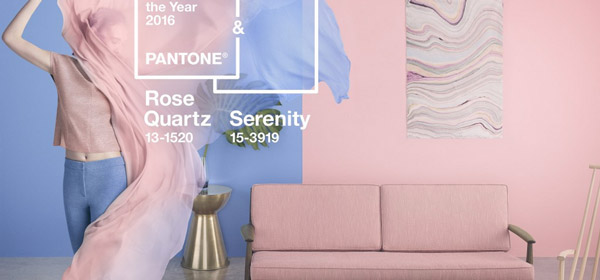
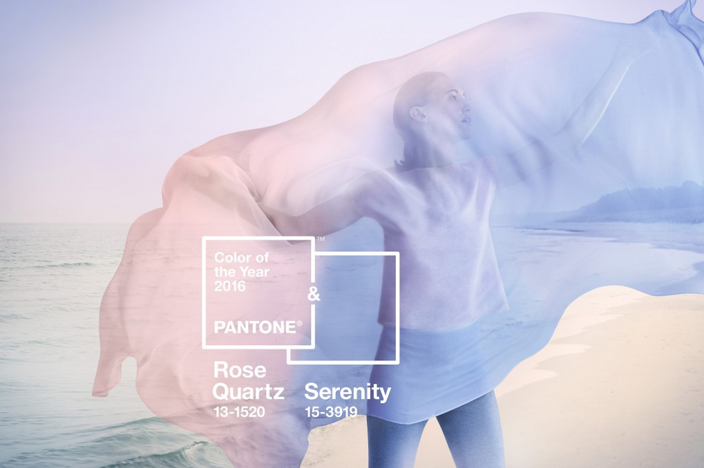
Pantone has announced its 2016 Colour of the Year – and it’s a curveball. For the first time ever, the global colour authority has picked a combination of two for the year ahead: Pantone 15-3919 Serenity and Pantone 13-1520 Rose Quartz.
According to Pantone, 2016’s combination is “a harmonious pairing of inviting shades that embody a mind-set of tranquillity and inner peace.”
Pastel pairing
“As consumers seek mindfulness and well-being as an antidote to the stress of modern day lives, welcoming colours that psychologically fulfil the yearning for reassurance and security are becoming more prominent,” says Pantone.
“Weightless and airy, like the expanse of the blue sky above us, Serenity comforts with a calming effect, bringing feelings of respite and relaxation even in turbulent times. Rose Quartz is a persuasive yet gentle tone that conveys compassion and a sense of composure.”
Tapping into 2016’s trends
We’ve reported on the gender blur increasingly seen across fashion, and Pantone’s 2016 Colour of the Year – the combination of Serenity and Rose Quartz – only accentuates this movement.
“This more multilateral approach to colour is coinciding with societal movements toward gender equality and fluidity, the consumers’ increased comfort with using colour as a form of expression which includes a generation that has less concern about being typecast or judged, and an open exchange of digital information that has opened our eyes to different approaches to colour usage,” said Leatrice Eiseman, Executive Director of the Pantone Color Institute.
Head over to the Pantone site for more
Article Author: Julia Sagar
Original Article posted in: Creative Bloq